Charts and graphs can go in your results, or at the end of your paper. They should be labeled and include a short description. Before putting them in, consider:
Purpose
Do not feel obligated to include charts, tables, or graphs. Consider first, what is their purpose? A visual should present complex data in a way that makes it more manageable for the reader.
Connect
Connect it to the main text with a clear and concise description. For example, "Figure 1 shows the relationship between X and Y." This sets the context for the reader.
Place the figure near the paragraph where it is first mentioned, either immediately after or on the following page. This keeps the text and visual information connected.
Labeling
Label figures in the order they appear in the paper (e.g., Figure 1, Figure 2, Figure 3).
Provide a brief but descriptive caption that explains what the figure shows. It should give enough information for the reader to understand the figure without referring back to the main text.
Kinds of Visuals
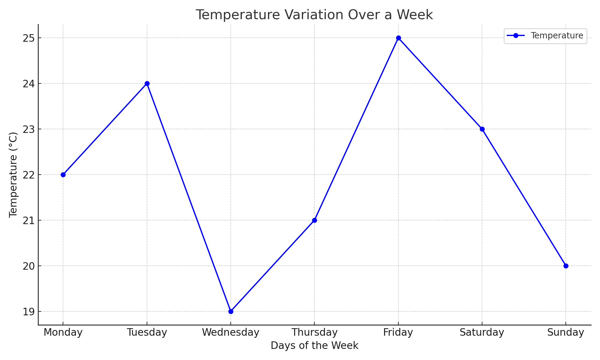
Figure 1: Temperature Variation Over a Week. The graph shows daily temperature changes measured in degrees Celsius from Monday to Sunday. Temperatures peak on Friday at 25°C and reach the lowest point on Wednesday at 19°C, indicating fluctuations throughout the week.
Graphs, Charts, Scatter Plots
Equations and Formulas:
Table 2: Temperature Variation Over a Week. The graph shows daily temperature changes measured in degrees Celsius from Monday to Sunday. Temperatures peak on Friday at 25°C and reach the lowest point on Wednesday at 19°C, indicating fluctuations throughout the week.
